I’m spending the day doing hand-built detailed elevation profiles for the Mississippi River ride on a website called GPS Visualizer. Both RidewithGPS and the Google Maps API will automatically create profiles from a route, but for the reason I will explain here I find them about useless for anything other than quick general info.
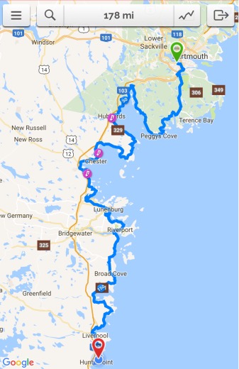
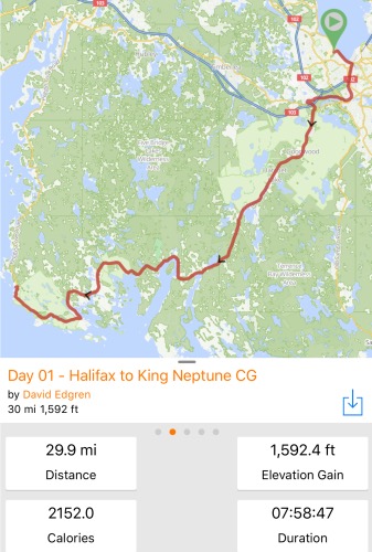
Here’s why. The next two images are greatly reduced Google Maps of two of the 50 mile/80 km days I have broken the entire 2,250 mile/3,621 kilometer route into.


If you look to the last 25 miles/40 kilometers of each day’s elevation chart you will see a what appears to be a honkin’ big hill in about the same place each day. Note that the x-axis “Distance” of each chart is exactly the same length- 50 miles/80 km. If that’s as far as you look, though, you are left with a sense that each day there will be quite a challenge right after lunchtime. A closer look, though, discloses that the y-axis “Elevation” of each chart, even though appearing to be divided into equal units, could not be much less comparable. The elevation “window” of the day on the left is about 400 feet/122 meters. The day on the right is about 40 feet/12 meters.

Now, I know that the folks at Google Maps and at RidewithGPS aren’t trying to mislead or confuse me. I’m sure that there are considerations that cause the charts to be created the way that they appear, and that in fact most everyone takes away useful info when they look at them. But here’s the two GPS Visualizer charts for the last 25 miles/40 kilometers of each day with the Elevation axis using the same measurement units. First, the one that we know has the truly monster hill.
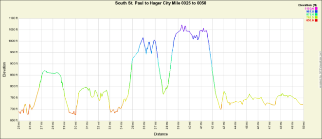
That clearly is going to present a challenge. The second chart…

Not so much, eh?